Wednesday
Oct292014
#HowDoYouDo
Posted on  October 29, 2014 Category: Bulletin
Bulletin 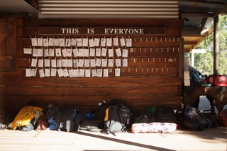
DO AUS event producer Caz Pringle discusses the art of disconnection for reconnection, and how DO excels at it.
About • Contact • Follow on Bloglovin • RSS

The Bulletin offers the latest news from anything and everything DO. Keep up to date with upcoming workshops, learn of exciting updates to the DO Universe and keep track of progress in Wales, the US and Australia.
Here we offer a guiding hand through our extensive back catalogue of inspiring talks by highlighting some of the best and the underrated from our archive. These synoptic articles are designed to help you discover which talks most interest you with ease. If your interest is piqued, click the link to watch the whole DO Lecture.
Every Friday we'll be scouring through our DO Lectures Library to bring you up to date with both past speakers and past attendees. We'll find out how those three days changed them, how things have progressed for them since and what they think makes DO so special. In a short but informative Q&A;, relive the experience from both perspectives; catch up with the people who gave your favourite talks and those that were there to witness them.
All around the world, people are DO-ing incredible things and, for the most part, going unnoticed. Here we aim to shine a spotlight on individuals or organisations that are going against the grain and making a difference to celebrate the impact of DO-ing.
Things are changing. The DO Lectures is being brought home to the farm. The Ideas Farm. Follow the Little Hieatts, our on-the-ground reporters, as they document the journey from idea to reality in preparation for what's to come.
We've hosted some great lectures. We've heard some amazing things. Pick up your sound bite of inspiration in the form of a thought provoking quote and use it in a way that makes it more than simply just words.
We'll be cherry picking events and causes from all over the world that offer us the opportunity to actively get involved and DO some good; be that by donating money, time or simply interest. Let's challenge ourselves to be something other than an impassive audience.
Midweek can be a bummer. You're running out of steam and you've still got a day getting in the way of you and Friday. The perfect time, then, for a little pick me up. Why not grab a cuppa, sit yourself down and peruse through these stories. After all, we share them for the sole purpose of making you feel good.
A Sunday roundup of the great and the wonderful from the four corners of the web. Like the Sunday paper that you can enjoy over your morning coffee, except with better news. We'll cover design, art, culture, business and anything else we think is cool; keeping you updated with the lesser known goings-on around the internet.
DO USA is back for their fourth event this September just north of San Francisco, hosted in a beautiful spot called Campovida. With their sun streaked skies and Hopland hospitality, it's promised to be a highlight in the DO calendar. Keep a track of their journey here and on Twitter.
DO Australia arrived on the DO calendar with an almighty bang this April. Their inaugural event at the idyllic Payne's Hut brought that enigmatic DO spirit to the land down under. They'll return in 2015 even stronger. You can get all the event details here, watch their progression on the blog or follow them on Twitter.
Wales was where it all started, where DO was born. In 2014, things are changing for DO Wales. It's being brought home, to the Ideas Farm. Keep up to date with all the latest Welsh news by following their bulletins and their Twitter stream.
Bulletin
DO AUS event producer Caz Pringle discusses the art of disconnection for reconnection, and how DO excels at it.
Bulletin 
It's a full house. DO Australia release their newest batch of talks and the finale to their live launch campaign.
Do-ers
Coats for the homeless made by the homeless; meet Veronika Scott, the founder of The Empowerment Plan.
Wanderlust 
Celebrate a year of Wanderlust with yup ... you guessed it ... another delightful trip around the interesting of the internet.
Bulletin
Dive into an incredible DO USA 2014 experience through the beautiful eye of photographer Jessie Webster.
Do Good 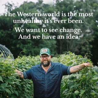
Rohan Anderson launches 'The Nursery Project'; the purest of weapons in the war against shit food and bad health.
Bulletin 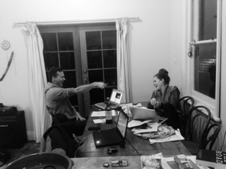
Hear from our awesome DO Australia producers Caz and Matty as they barrel their way towards their 2015 event.
Do-ers 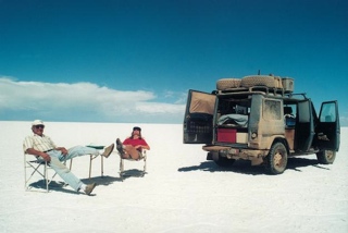
The seventy-six year old adventurer who has spent over a quarter of a century travelling the world in his trusty Mercedes.
Wanderlust
In need of some interesting? Well, let us take you on a guided tour of the best the internet has to offer.